5/1/24
Written by
Martin Sully

110% of conversations I have with business owners begin with them telling me they want to zhush up their brand. Whether it's from a visual aspect, a reputational aspect, or their business has changed so much that they feel awkward explaining their business to someone else.
It all points to getting the message right. This can be a tweak to the brand identity or a complete visual identity design alongside the strategy.
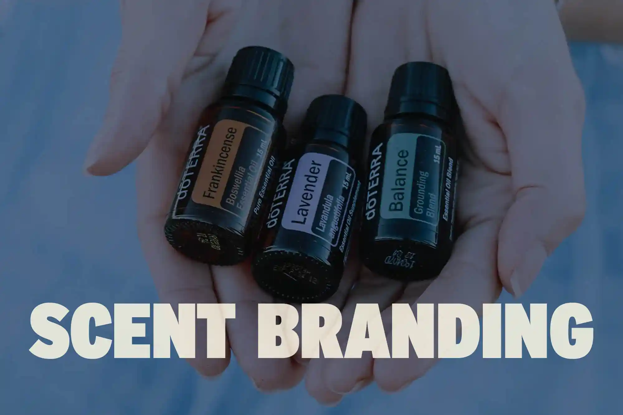
And, early doors in most businesses, we get hustled to get a brand identity. If your brands not on the gram or TikTok, you probably don't have a business.
They usually want something like this:
This, of course, is a stereotype, but the top 3 are the ones people want early on. They focus on the sexy part of the business first without understanding what their position is in the market. This comes from the necessity to launch and generate money.
With programs like Canva and AI-generated logos, they can create logos in less than 5 minutes. Logos, fonts and colour palettes come together without too much heavy thinking, allowing them to get ahead.
Here's the kicker, 20,000 other brands just downloaded a near identical logo with a similar colour palette and font choice.
The first step is to identify your direction. What's your brand trying to communicate, and to who?
You can't pluck colours from thin air, scroll Instagram, or look for trendy colour palettes. Trending colour palettes, such as Pantone's Colour of the Year, highlights a particular colour they think is topical – some of the previous colours have focused on things like sustainability, nurturing kindness, compassion or connection. And whilst I think these are important for modern brands, it's not going to fit every business.
As a result, a sway of new companies starts using the colour, even if it's not a good fit for the brand.
If you're picking colours from things you're seeing, there's a good chance it's coming from personal preference, which is ok, but it might not be a colour your customers resonate with the most or what makes you stand out from competitors.
Hypothetically, imagine this.
You have a clothes label.
You know your ideal target market, understand your customer personas, have a clear brand personality, know your message and how you're communicating feelings.
You want to be perceived by people in a certain way.
You know your competitors.
You design environmentally friendly, long-lasting clothing and put in all the hard work before diving into your visual identity.
Your target market is women who hate fast-fashion, who want to help save the planet by owning quality clothes that last a lot longer. The brand is backed by research and finding new ways to contribute to cleaning the oceans and supporting a brighter future.
You want people to know that the brand is credible and that you test products and maintain high levels of quality control.
The goal is for people to consider their purchases and know where their clothes come from. There's no place for hesitancy when it comes to protecting the planet.
If we are looking at brand archetypes, it would be a mix of the sage and caregiver.
Words used to describe it are bold, radical, unforgiving, fearless.
What brand colours would be a good match?
If it were me picking a colour palette for this brand, I'd first look at what its competitors do. This makes sure we aren't going to pick something identical. And helps make a final decision easier – remember, I want them to stand out, not blend in!
Competitors all use white, black, greys and sage greens. Those really soft, clean-cut colours. One stood out using a blue and a red, but this seems a bit aggressive to me.
I'd look at the brand personality and words like fearless and radical to set it apart and mix that with the target market.
I'm leaning towards picking a solid core colour like a bright yellow – indicating a brighter future and complementing it with 1 or two colours like a hot pink as an accent. And perhaps a slightly toned back version of pink, with a hint of yellow. Finally, I'd choose two neutrals, a dark ocean greeny/blue colour and a crisp white.
And, remember, even if you pick a similar colour palette to a competitor, it's all about how it's applied – this will change the mood and feeling. Say they pick a complimentary colour of sage green and use it 10% of the time. You could reverse this and make it your core (primary) colour – using it, say 80%.
Here's some tips to help you pick your brand colours.
If you follow the tips above, and maybe take a look at a site like Pinterest, this will give you some colour combination inspiration, and get you well on your way to choosing brand colours.
And remember, brand colours are much simpler to choose if you are clear on your brand strategy.
Need support? Book a Discovery Call.
Not sure where you want to go? We can chat through your brand, personal goals and work out an action plan.